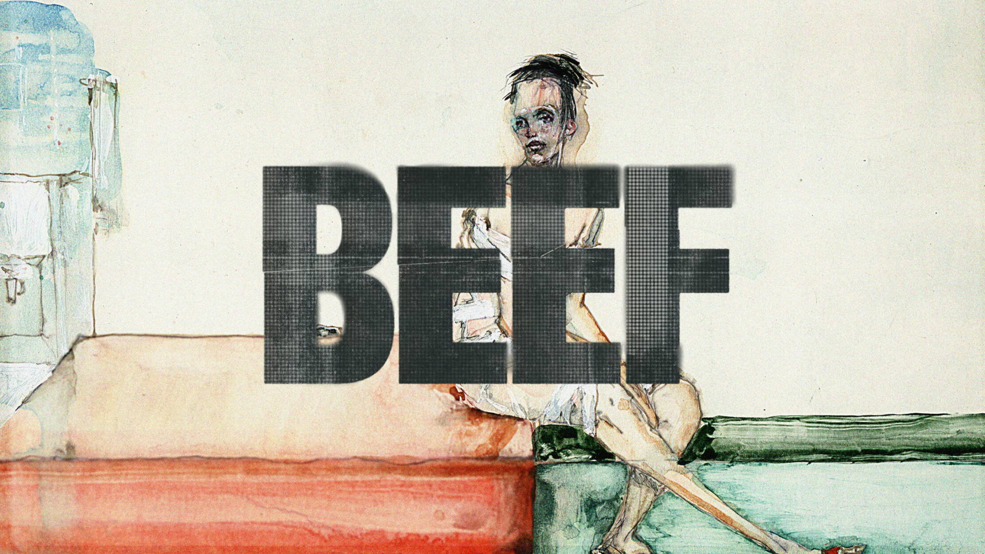
BEEF
Lee Sung Jin, the creative mind behind the show, was looking for a series of title cards that felt disruptive, to interrupt the flow of the cold open from each episode.
On this project, I designed the logo, type layout, and texture direction that was chosen by the client from our pitch. Throughout production, the execution of each episode design was split between myself, Tony Agliata, and Davis Chu.
Studio: Sarofsky
Executive Creative Director: Erin Sarofsky
Executive Producer: Steven Anderson
Creative Lead: Duarte Elvas
Designers: Daniel Geiszler, Tony Agliata, Davis Chu
Producer: Kelsey Hynes

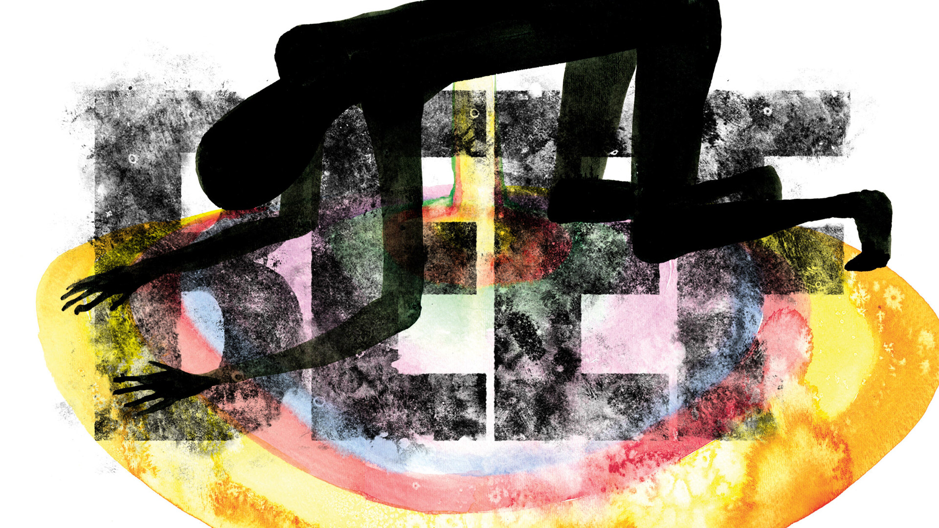
Main Title Cards
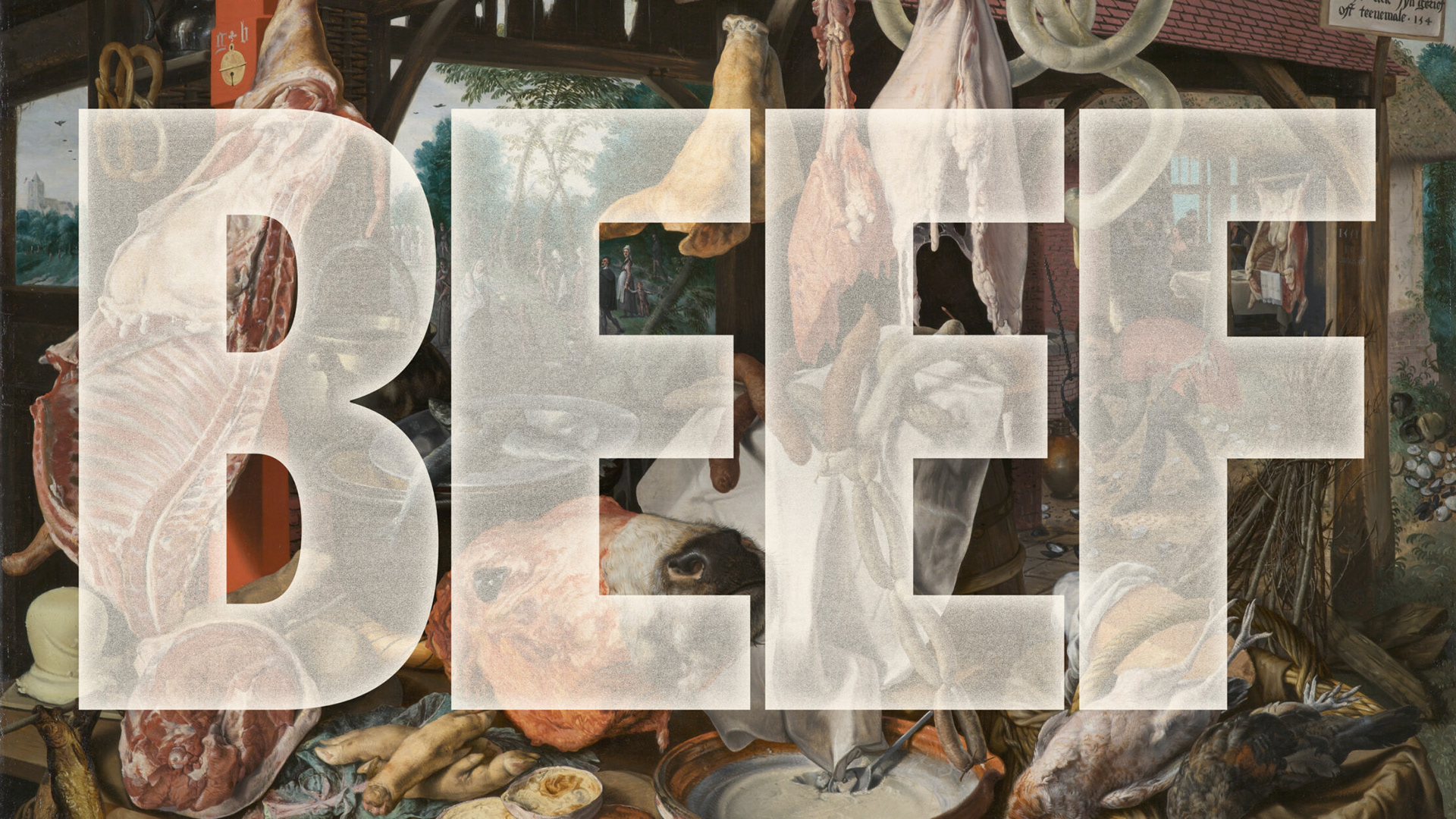
Each of the title treatments is set over a painting by artist David Choe that signifies a mood which matches the quote used for each episode title.
Heavily inspired by 90’s album covers and magazines such as Ray Gun, the treatments feel like artwork you can print on a shirt or make a cool poster you would want to frame and hang on your wall.

The Credits
For the logotype and the show credits, we developed a customized version of Balboa, a clean grotesque that is quick to read and has the right impact that the production team was looking for.
The episode titles are set in Degular which, as a less condensed sans serif, pairs well with Balboa and its simplicity doesn’t take attention away from the paintings.